Claims & EOB · Concept case study
Why do I owe this?
Redesigning the claims and Explanation of Benefits experience so members know what they owe, and why, in under a minute.
Goal: 4 of 5 members can say what they owe, and why, without calling anyone.
The problem
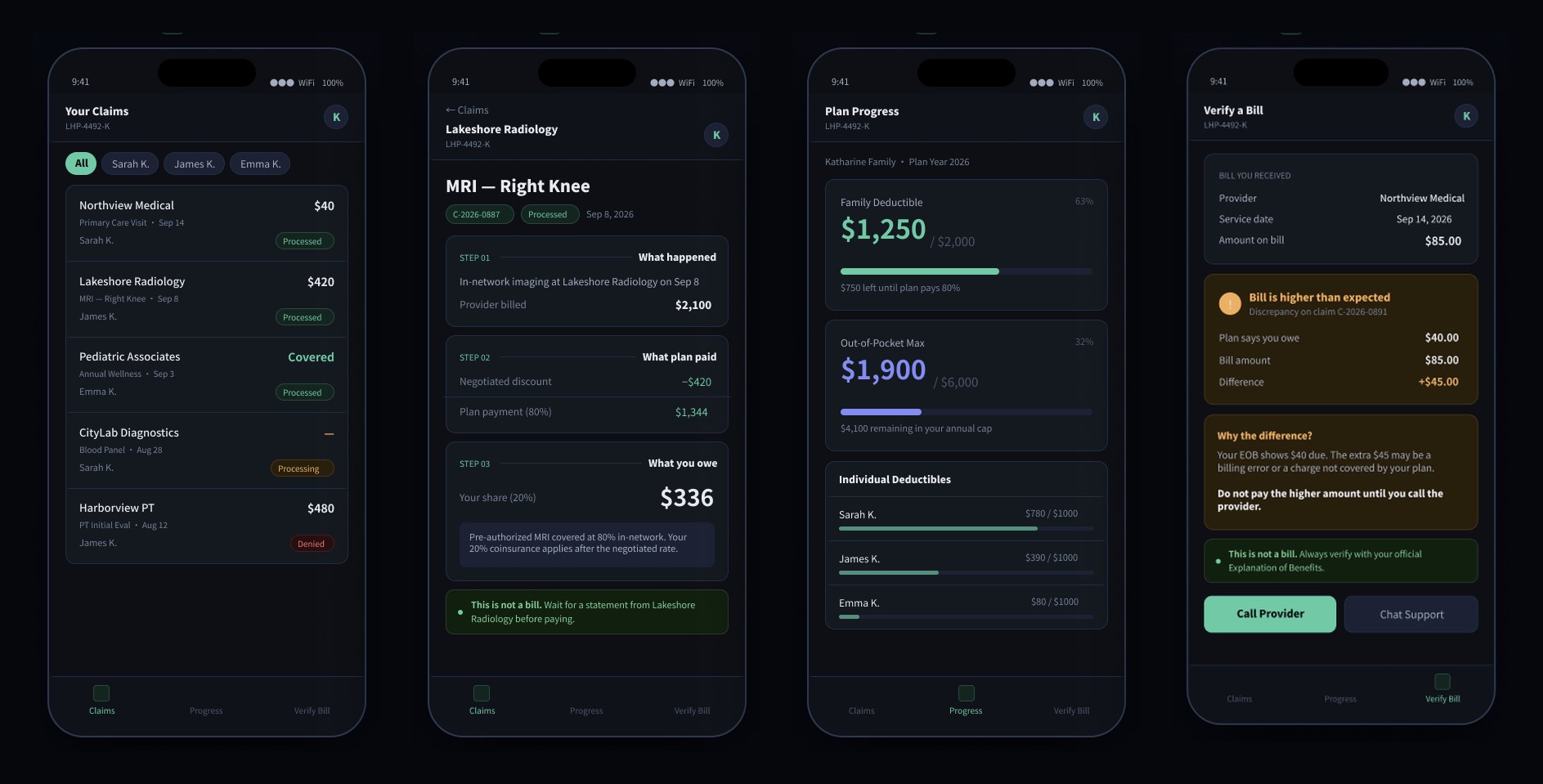
Two documents that look the same. One isn’t a bill.
After a doctor’s visit, members get an Explanation of Benefits from their plan and a bill from their provider. The two are easy to confuse. Some people pay an EOB that isn’t a bill; others pay a bill without checking it against what their plan says they owe. Many just call member services.
As a CNA and home health agency owner, I’ve watched patients and families get lost in exactly this gap between care and coverage.
Help a member understand what happened, what their plan paid, and what they owe, without calling anyone.
Starting hypotheses
What I believe, and what I still need to prove
This is a concept project. These hypotheses come from my clinical and home health experience and shaped the first design. Each one needs to be validated with real members before it’s treated as a finding.
So: say “This is not a bill” clearly, on every claim.
To validate: ask members to sort an EOB and a bill.
So: walk through the claim in plain steps: what happened, what the plan paid, what you owe.
To validate: ask members to explain “coinsurance” in their own words.
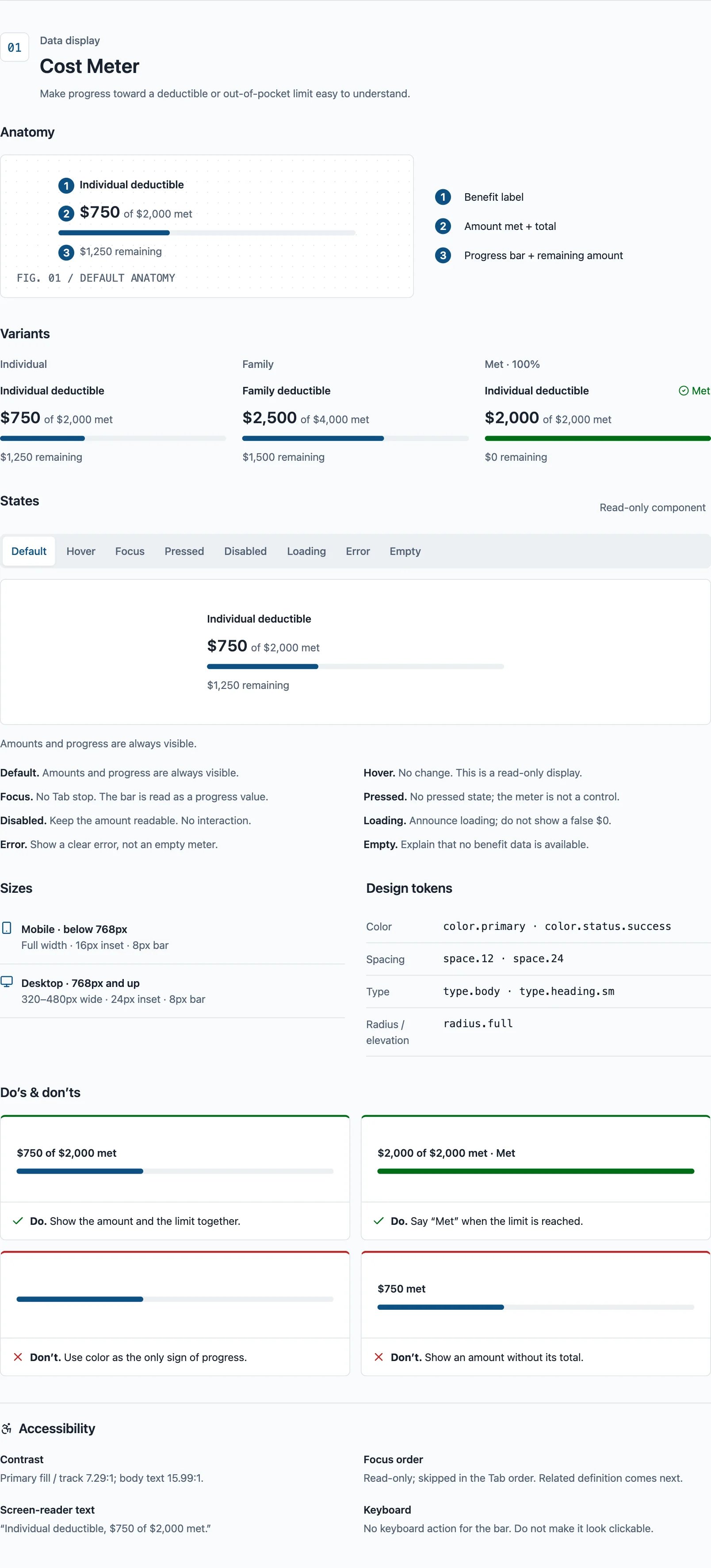
So: show deductible and out-of-pocket progress for each family member.
To validate: ask members how much is left on their deductible.
Design
One screen, three answers
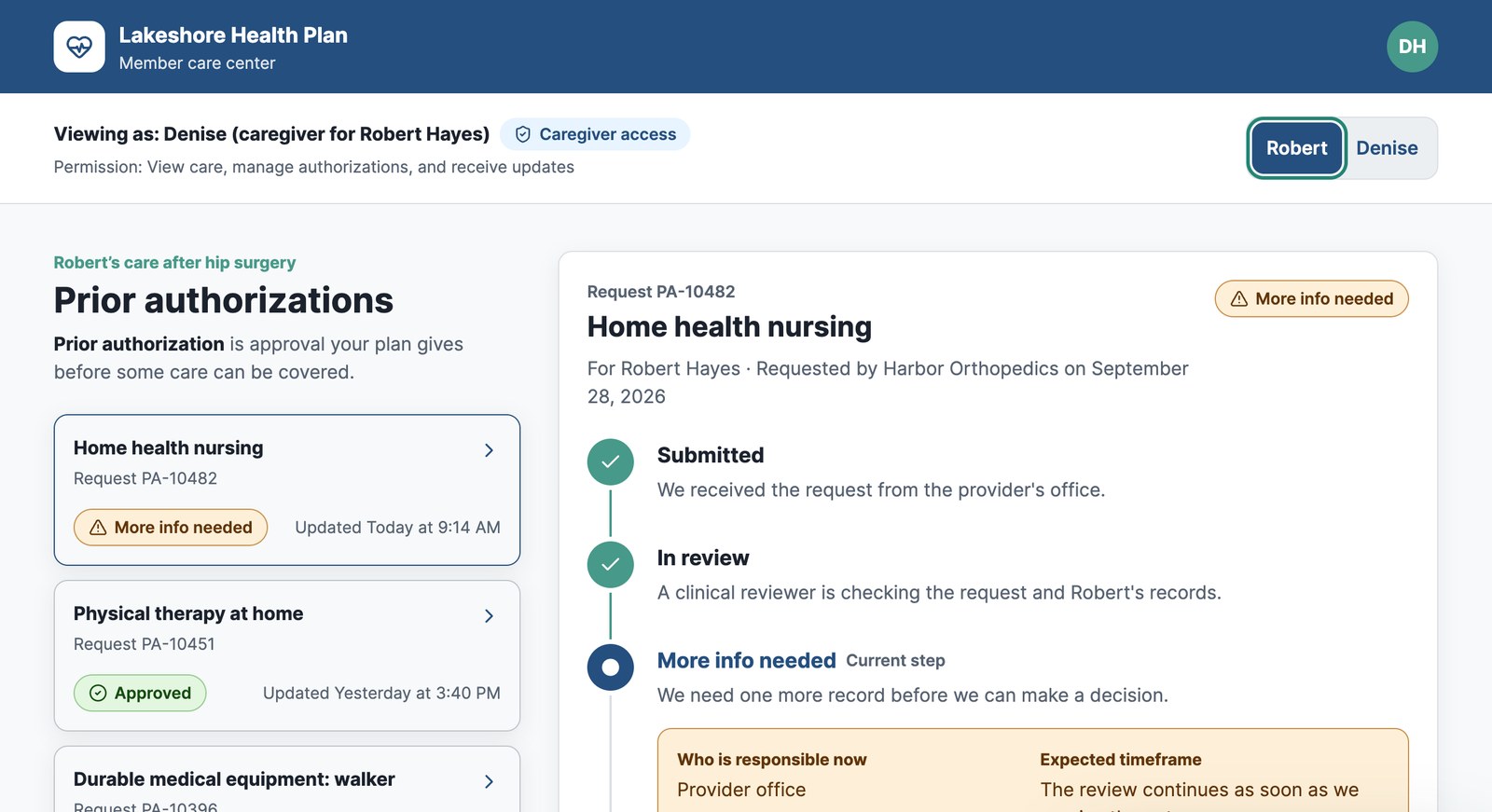
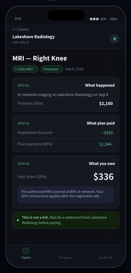
I designed around one core task: “I got a bill and want to know if it’s right.” The claim detail answers three questions in order: What happened? What did my plan pay? What do I owe, and why?
| Decision | Why | Tradeoff |
|---|---|---|
| Step-by-step breakdown: What happened → What plan paid → What you owe | Turns a wall of numbers into one story with a clear end | Claim codes move into a details view |
| “This is not a bill” on every claim | The most common confusion I’ve seen in families | Uses space at the bottom of the screen |
| Deductible meters per family member | Families share one deductible but track it per person | Needs real-time data from the plan |
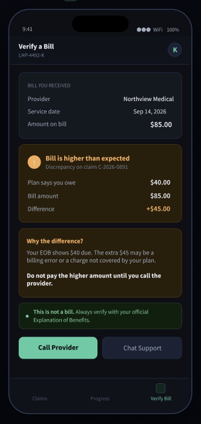
| “Verify a bill” check, flagged in amber when the bill is higher | Catches billing errors before the member pays | Member has to enter the bill amount |
Validation plan
How I’ll know it works
Next step: a moderated test with 5 members, comparing a typical EOB to this prototype on the same three tasks. These are my targets, not results.
| Task | Success target |
|---|---|
| Find out how much you owe | 4 of 5 without help |
| Explain why you owe that amount | 4 of 5 in their own words |
| Check whether a bill is correct | 4 of 5 spot the $45 difference |
If this launched, I’d track: claim-related calls to member services, the share of members who open claim details in the app, and how often “Verify a bill” catches a mismatch.
Reflection
In insurance UX, the words are the interface
Most of the work in this project was in the labels, not the layout. Plain words like “What you owe” and “This is not a bill” do more than any visual treatment.
Next: run the validation test, switch to a light theme for older members, test with screen readers and Spanish-speaking members, and connect denied claims to a guided appeal.
Prototype: Try the live prototype